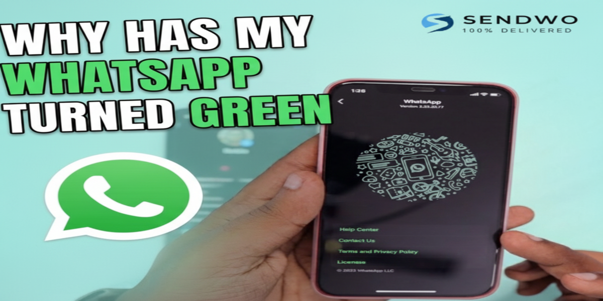
Imagine picking up your phone one morning and opening WhatsApp, only to find the familiar interface has suddenly turned green. The chat bubbles, icons, and headers now sport a brighter green hue instead of the old color you were used to. If you’ve experienced this surprise, you’re not alone. Millions of users have been asking, “Why has my WhatsApp turned green?” on social media and forums in recent months. Spoiler alert: it’s not a glitch or a virus – it’s an official update from WhatsApp (owned by Meta) designed to refresh the app’s look and feel. In this comprehensive guide, we’ll delve into why WhatsApp changed its color scheme, what it means for you, and how to navigate the new green interface like a pro. Why has my WhatsApp Turned Green logo reflecting the app's refreshed color scheme and brand identity.
1. WhatsApp’s Green Interface Update Explained
So, Why has my WhatsApp Turned Green now? The short answer is that WhatsApp rolled out a major design update in 2024 that introduced a new, consistent green color palette across the app. According to an official statement from Meta, this change was part of an effort to “bring a modern, new experience to WhatsApp” and “make it more accessible and easier to use”. In other words, WhatsApp refreshed its interface to keep the app looking fresh and user-friendly – and the iconic green color took center stage in the redesign.
This update was gradually rolled out starting in early 2024. It initially caught many users off guard, especially on iPhones. On iOS devices, WhatsApp’s interface had previously used a lot of blue tones (for example, chat bubbles for outgoing messages were blue). After the update, everything switched to shades of green, matching WhatsApp’s signature logo color. The result? iPhone users woke up to a very different-looking app, and many hopped onto X (Twitter) and other platforms to voice their surprise and confusion. One startled user tweeted, “Who the hell told WhatsApp that all this green was a good idea??” – reflecting the mixed feelings toward the sudden visual change.
For Android users, the change was less dramatic. WhatsApp’s Android app has always been green-themed to some extent (the WhatsApp icon and header were green). The 2024 update did tweak the shade of green to a slightly different tone, but it’s a subtle shift many might not notice without a side-by-side comparison. Android users did benefit from other interface improvements though – for example, WhatsApp’s dark mode became one shade darker for better readability, and more neutral colors were added in places so that the iconic green accents stand out more intentionally.
No, it’s not a bug or hack: If you’re worried something is wrong with your phone because Why has my WhatsApp Turned Green, rest assured it’s an intended change. Many users initially suspected a glitch, but WhatsApp’s green interface is official and permanent. In fact, Meta has confirmed that everyone will eventually see the new green design and there’s no opt-out option to revert to the old color scheme. A community expert on Apple’s forum clarified to confused iPhone users: “It’s just a new update, don’t worry your iPhone isn’t hacked… WhatsApp decided to change the color to green to match their brand”. So, the bottom line is: Why has my WhatsApp Turned Green, because the app was updated with a brand-new design.
2. When and How Did WhatsApp Turn Green?
To give you a bit of timeline, WhatsApp’s green makeover rolled out in phases:
Testing and Initial Launch: Rumblings of a new interface began in late 2023, and by February 2024 some iOS users started seeing the new green theme after updating their app. This was a staggered release; not everyone got it at once.
iOS Users Get the Green Update: The change was most noticeable on iPhones because WhatsApp’s iOS version had used a blue-colored chat bubble/theme for years. The update flipped the color scheme to WhatsApp’s trademark green across all screens. By March 2024, early adopters on iOS were buzzing about their chats turning green overnight.
Global Rollout by Spring 2024: Over the next couple of months, more regions and users received the update. For example, by April 2024 many users in India (and elsewhere) on iOS woke up to find Why has my WhatsApp Turned Green-themed instead of the usual blue. Android users also got app updates with the refreshed design around this time (though again, the color difference for Android was minor).
By Mid-2024: The new interface had reached the majority of WhatsApp’s 2+ billion users worldwide. If someone’s WhatsApp was still blue at that point, it just meant they hadn’t updated their app yet. (And indeed, WhatsApp’s team made sure that sooner or later, everyone would have to update – the old design was being phased out completely.)
3. Why Only iOS Had Blue (and Why It’s Green Now)
You might be wondering: Why were iPhone users seeing blue in the first place, Why has my WhatsApp Turned Green? Historically, WhatsApp’s design on iOS followed some of Apple’s design conventions. On iPhones, the outgoing chat bubbles in WhatsApp used a blue shade (similar to iMessage’s blue bubbles), presumably to feel native to iOS. Meanwhile, Android’s WhatsApp always used green bubbles. This meant for years there was a slight platform inconsistency – WhatsApp looked a bit different on iOS vs Android.
With this update, WhatsApp/Meta decided to unify the brand’s look across all platforms. Green has always been WhatsApp’s primary brand color (Why has my WhatsApp Turned Green, logo with the white chat bubble phone icon). Now the entire interface aligns with that brand identity on every device. Meta likely wanted WhatsApp to be instantly recognizable with its trademark green no matter where you use it. An added benefit is consistency: if a user switches from iPhone to Android or vice versa, WhatsApp will now look and feel more uniform.
From a branding perspective, green also conveys certain meanings that WhatsApp may want to emphasize. According to branding experts, green often symbolizes growth, freshness, and security. By doubling down on green, WhatsApp reinforces its identity as a secure, trustworthy messaging app – the green color subtly reminds users of encryption and safety (think of how green is used for “secure” padlock icons in browsers). In an age where privacy is paramount, that psychological association doesn’t hurt. WhatsApp’s team even mentioned that using color more intentionally was a goal, so that users can “focus on the things that matter most on the screen” without unnecessary clutter.
4. What Exactly Changed in WhatsApp’s New Design?
The headline change in this update is obviously the color scheme – WhatsApp’s interface is now a vibrant green theme. But that’s not all. This was a comprehensive design refresh. Here are the key changes and new features introduced:
New Green Color Palette: The shade of green used throughout the app is slightly different from the old one. It’s a bit brighter and more eye-catching than the previous dark green. Meta’s design team experimented with dozens of shades (they “considered over 35 different color iterations”) before landing on this one that aligns perfectly with WhatsApp’s brand. The green is used more sparingly but intentionally – for example, important icons or buttons are green, whereas less critical UI elements might be gray or neutral. This contrast helps important features stand out.
iOS: Blue to Green, plus Layout Tweaks: On iPhones, all the blue elements Why has my WhatsApp Turned Green – this includes chat bubbles for sent messages, header bars, icons for things like send button or attachments, and even link previews (hyperlinks that used to show as blue text are now green text in WhatsApp). In addition, WhatsApp gave iOS a slight layout refresh: some icons changed shape/style and there’s a bit more spacing between buttons and elements for a cleaner look. For instance, the Settings, Calls, and Chats icons at the bottom got a redesign (more rounded, outline-style icons) and extra padding was added to make tapping easier. Even the WhatsApp logo now appears at the top of the Chats tab on iOS, reinforcing the brand presence.
Android: Darker Dark Mode & Bottom Navigation: On Android, WhatsApp’s dark mode got even darker. Based on user feedback, the dark theme was tuned one notch deeper, improving contrast and legibility for nighttime use. The light mode on Android also gained more whitespace for a cleaner appearance. Another big change for Android is the introduction of a bottom navigation bar (finally catching up to iOS which had bottom tabs all along). The main tabs – Chats, Calls, Communities, Status (now called “Updates”) – moved from the top of the screen down to the bottom, making navigation more ergonomic for your thumb. This follows modern Android design guidelines and makes the app more consistent across platforms.
Refreshed Icons and Illustrations: WhatsApp updated many of its icons to a new style. Meta describes them as a rounded, outlined style now. If you look closely, icons for things like New Chat, Settings, or the various action buttons have a more minimalist line-based design. Along with that, the fun doodle illustrations (for example, the background pattern or the graphics you see when you have no chats) were also refreshed to match the new aesthetic, and some even have subtle animations to feel more lively.
New Attachment Tray on iOS: Another nice tweak for iPhone users – sending photos or files is smoother now. Previously, tapping the “+” or attachment icon on iOS brought up a full-screen menu. With the update, it opens an expandable bottom tray instead. This means you can still see part of your chat while choosing a photo or document to send, making the process more intuitive.
Improved Chat Management (Filters): To help users manage conversations, WhatsApp introduced chat filters in the chat list. If you have a lot of chats, you can now filter them (e.g., unread messages, or view only group chats) with one tap using the new filter buttons at the top of the chat list. This feature, combined with the new navigation bar, makes it easier to quickly find specific chats without endless scrolling.
Performance and Accessibility: While not visually obvious, Meta indicated that many of these changes were aimed at improving usability and accessibility. The increased spacing, higher contrast text onWhy has my WhatsApp Turned Green background, and larger tap targets all help make WhatsApp easier to use for all, including people who may have visual impairments or use screen readers. The new color scheme was tested to ensure it’s readable in various conditions – for instance, the chosen green provides better visibility in direct sunlight and on different screens. In fact, tests showed that the new green improved visibility under bright light by ~19%, and it even consumes about 3% less power on OLED screens (since it’s slightly less saturated). Little improvements like these enhance the overall experience.
Bonus – New Formatting Features: Alongside the visual changes, WhatsApp also rolled out functional updates around the same time. One noteworthy addition was new text formatting options in chats. WhatsApp introduced the ability to create bulleted lists, numbered lists, block quotes, and code blocks in your messages. This was a big deal for power users who wanted to add more style to their messages (imagine neatly sending a shopping list or emphasizing a quote in a chat). These features show that WhatsApp’s update wasn’t just about a pretty new color – it’s about making conversations more productive and fun too. So if you’re exploring the new green WhatsApp, try out typing “- ” at the start of a line to make a bullet list, or “```” to create a monospaced text block – it’s pretty handy!
In summary, Why has my WhatsApp Turned Green update is part of a broader refresh to keep the app modern. Yes, the color is the most noticeable change (and the one that got everyone talking), but as we can see, WhatsApp’s team used this opportunity to introduce many usability enhancements. It’s like giving the app a fresh coat of paint and renovating the rooms inside at the same time.
5. Why Did WhatsApp Make This Change? (The Bigger Picture)
Whenever a popular app makes a major design change, users inevitably ask “Why change something that wasn’t broken?” In the case Why has my WhatsApp Turned Green, there are a few key reasons behind the scenes:
Unified Branding: WhatsApp has always been associated with the color green – its logo, website, and marketing all use green heavily. However, the in-app experience on some platforms (like iOS) didn’t fully reflect that. By turning the interface green universally, Meta is strengthening WhatsApp’s brand identity. Now, the moment you open WhatsApp, the color scheme itself tells you what app you’re in. This kind of brand consistency can improve logo recall by around 7%, which is significant for a product used by billions. In fact, after the update, WhatsApp noticed a small uptick in usage of WhatsApp Business features, likely because the branding was more front-and-center.
Keeping the App Feeling “Fresh”: Apps, like any product, can start to feel stale if the design never changes over the years. Competing messaging apps and social media constantly update their look to appear modern and exciting. WhatsApp’s last major design tweak was quite a long time ago, so this green overhaul signals a “new era” for the app’s look. It grabs user attention and says “hey, WhatsApp has evolved.” This is a common strategy in tech – a visual refresh can rekindle user interest and make an old app feel new again. Indeed, WhatsApp likely hoped that a fresh design would get people talking (which it did) and re-engaging with the app.
User Experience Improvements: Beyond branding, WhatsApp’s designers had concrete UX (user experience) goals. The new color scheme was chosen not just to look good, but to be easier on the eyes. The bright blue on white (on iOS) could be stark; the new green is a bit softer in contrast. WhatsApp claims the green interface can reduce eye strain during long chats, especially in low-light conditions. And remember, they paired the color change with things like darker dark mode and better spacing – all aimed at making the app more comfortable to use for longer periods. There’s data to back this: internal tests reportedly showed the new design reduced visual fatigue by 23% in long usage sessions. So this isn’t change for the sake of change; it has usability rationale.
Strategic Consistency Across Meta Apps: Meta (Facebook’s parent company) has a history of aligning the design language of its family of apps (Facebook, Instagram, WhatsApp, etc.). By updating WhatsApp’s interface, Meta brings it closer in line with modern design practices seen in their other apps. It wouldn’t be surprising if some elements of this WhatsApp redesign (like the bottom nav bar on Android, or the rounded icon style) were influenced by user interface research that Meta conducted across all their products. Consistency in design can make it easier for Meta to introduce cross-app features down the line, and it also reinforces that WhatsApp is part of the Meta ecosystem without explicitly rebranding it.
Standing Out and Future-Proofing: WhatsApp faces competition from apps like Telegram, Signal, WeChat, and others. While WhatsApp has the advantage of a massive user base, it still needs to keep up with trends. A slick new design can appeal to younger users and markets where design trends change quickly. By adopting a clean, modern green aesthetic (some call it a more “Material” look on Android and a more “flat design” on iOS), WhatsApp ensures it doesn’t feel outdated. Meta’s design team likely also had an eye on future features – the refreshed interface can better accommodate new functions, such as integrating AI assistants or payment features, without looking cluttered. Think of the redesign as laying a groundwork that will serve for the next several years of updates.
To sum up, WhatsApp turned green for solid reasons: to unify its look, improve user comfort, refresh the brand image, and set the stage for future enhancements. It was a bold move (as evidenced by the initial outcry from some users), but one that Meta anticipated. They knew there would be some resistance – internal models predicted about 15–20% of users would initially dislike any major UI change, but that 90% would adapt within 45 days. And indeed, after the first few weeks of surprise (and even some 1-star app reviews by upset users), most people have settled into the new design. The initial spike of negative feedback subsided after about a month as users grew accustomed to the green. Now, it’s fair to say Why has my WhatsApp Turned Green and the majority of users have embraced it as the new normal.
6. How to Adapt to WhatsApp’s New Green Interface
Change can be hard, especially when it’s an app you use daily. If you’re still getting used to all the green in WhatsApp, here are a few practical tips to help you adapt (and even make the most of it):
Embrace Dark Mode if Bright Green Feels Harsh: If the light green background in chats is too bright for you, consider using Dark Mode on WhatsApp. In dark mode, the bubbles and accents turn a dark teal/green which some find more soothing on the eyes at night. On iPhone, WhatsApp will follow your system dark mode setting (or you can set WhatsApp to always use dark mode in its settings). This way, you still have the new design, but with a darker palette that might feel closer to the old colors. Many users who initially disliked Why has my WhatsApp Turned Green in light mode found the dark mode variant more acceptable.
Change Chat Wallpaper for Contrast: WhatsApp allows you to set custom wallpapers or background colors for your chat threads. If the new green bubbles aren’t to your liking, try changing the chat wallpaper to something that tones it down. For example, a darker or patterned wallpaper Why has my WhatsApp Turned Greentext bubbles pop less aggressively. While this doesn’t change the bubble color, it can affect the overall feel of the chat screen and make you more comfortable with the new look.
Understand There’s No Official Way to Go Back: It’s important to know that WhatsApp does not offer any toggle to revert the interface to the old blue or previous desig. The change is here to stay (Meta has called it irreversible and the “new norm” for all users). So, avoid searching for sketchy apps or “WhatsApp old version” APKs that promise to restore the old colors – installing those could risk your security or get your number banned. The safest course is to stick with the official app and get used to its updates.
Leverage New Features: Instead of just focusing on the color, explore the new features that came with the update. Try using the new list formatting, check out the attachment tray if you’re on iOS, or use the chat filters to organize your messages. By engaging with these features, you might start to appreciate the update as an improvement rather than just a cosmetic change. You’ll find that WhatsApp has become more functional and slick. For instance, creating a quick bullet list in WhatsApp (thanks to the new formatting options) can be oddly satisfying and useful for planning tasks with friends.
Adjust Phone Theme Settings (Android Only): If you’re on Android and you notice WhatsApp’s colors look even more different (for example, it doesn’t match screenshots of others’ WhatsApp), check your Android system theme settings. Newer Android versions (with Material You design) can auto-tint app colors based on your phone’s wallpaper or theme. It’s possible WhatsApp is adopting some custom colors due to this. To fix it, you can go into WhatsApp Settings > Chats > App Theme, and select Light or Dark instead of “System default.” Why has my WhatsApp Turned Green theme rather than any adaptive colors. Similarly, in your Android display settings, you can disable dynamic theming or change the accent color. This will ensure WhatsApp stays the pure WhatsApp green intended by the designers.
Give It Some Time: This might sound like generic advice, but it holds true. Often when a UI changes, our initial reaction is negative simply because it’s unfamiliar. Psychologists note that people have a change aversion bias – we’re inclined to dislike changes to things we’re used to, even if the change is objectively neutral or positive. If after a week or two you still really dislike Why has my WhatsApp Turned Green, then your feelings are valid. But chances are, after using WhatsApp for a while, you’ll stop noticing the color altogether and it will just feel normal. Remember when Facebook or Instagram last changed their look? Most of us complained for a week and then forgot about it. The same will likely happen with WhatsApp. Already, a large portion of users have adapted and moved on. Give yourself that adjustment period.
Communicate Feedback (if it matters to you): If you have strong feelings about Why has my WhatsApp Turned Green interface (good or bad), consider sending feedback to WhatsApp. There’s a “Contact Us” or “Send Feedback” option in WhatsApp settings. While you can’t change the design back yourself, user feedback is still valuable. If enough users express a particular grievance (e.g., “the green is too bright” or “please allow theme choices”), WhatsApp might take that into account in future updates. They might not revert to blue, but they could, for example, add an option for users to pick an accent color, or further tweak the green’s tone. WhatsApp has listened to user feedback on features in the past, so it’s not out of the question.
Finally, keep in mind why this change happened – it was to improve the app and align with WhatsApp’s identity. The app isn’t fundamentally different: your chats, features, and how you use WhatsApp all remain the same. It’s very much like your favorite store renovating with new paint on the walls; the products and people are the same, it just looks a bit different. And just like a store makeover can eventually feel welcoming after the newness wears off, the hope is that WhatsApp’s interface will feel just as comfortable (or more so) as the old one with a bit of use.
Conclusion
Change is never easy, especially when it hits an app you use every day to stay in touch with friends, family, and colleagues. WhatsApp’s shift to a green-themed interface might have been jarring at first, but it comes from a place of improvement and brand unity. By understanding the reasons behind the update – from enhancing usability to unifying the app’s look – it’s easier to appreciate the thought that went into it.
The new green WhatsApp is here to stay, and in time it’s likely to feel just as familiar as the old design. In fact, many users are already reporting that after a few weeks, they barely remember what the old interface looked like. WhatsApp has successfully turned the page to a fresh chapter, all while continuing to introduce features that make messaging more engaging (like those new text formats and chat filters).
As users, the best we can do is adapt and take advantage of what the updated app offers. Instead of asking “why has my WhatsApp turned green?” in frustration, we can confidently answer: because WhatsApp is evolving for the better. So the next time you open the app and see that vibrant green header or chat bubble, know that it’s a small part of a bigger effort to keep your messaging experience secure, modern, and enjoyable.
Call to Action: If you found this deep-dive helpful, stay tuned for more updates and tips on getting the most out of WhatsApp. Here at SendWo, we keep a close watch on every WhatsApp change so we can help users and businesses adapt quickly. 🎉 Explore SendWo – our platform takes WhatsApp to the next level, whether you’re a business wanting to send out bulk messages or an enthusiast looking to leverage WhatsApp’s full potential. Don’t let changes slow you down – embrace them and turn them into opportunities! Check out our resources and consider signing up for a free account with SendWo to supercharge your WhatsApp communication today. Happy messaging! 🚀
FAQ
Q1: Why has my WhatsApp Turned Green?
It’s part of WhatsApp’s 2024 design update. Why has my WhatsApp Turned Green interface to match its brand color across all devices. It’s not a glitch.
Q2: Is this green update a bug or hack?
No. It’s an official update by WhatsApp, not a bug or hack. The color change is intentional and completely safe.
Q3: Can I change it back to blue?
No, you can’t. WhatsApp doesn’t allow reverting to the old blue theme. Only light and dark modes are available within the app.
Q4: Why do only iPhone users notice it?
iPhones had blue chats before, so the green change stands out more. Android already used green, so users there saw only minor tweaks.
Q5: When did WhatsApp turn green?
The update rolled out in late February 2024, with most users noticing between March and April. It was mentioned in app update notes and tech news.
Aditi, a content marketer at SendWo, is a passionate writer and marketing enthusiast. She excels in driving revenue campaigns, building client relationships, and mastering content creation, SEO, customer service, and project management.
SendWo is Meta's official business solution Provider. Broadcast Bulk WhatsApp messages and automate using AI Chatbots.